1) google.com
2)
3)
Category Archives: Uncategorized
Create an Easter Egg with Illustrator

Filed under Uncategorized
Official Website of “Louis Vuitton”

This is the official website of brand “Louis Vuitton”.
http://www.louisvuitton.eu/front/#/eng_E1/dispatch
When I first get into website, welcome page with choosing location page is show up with background seems like old luggage bag with stickers of all different country. Once I choose the location, it changes to black background and loading the page with the animation of their brand mark. It is very unique that they use their famous brand mark to make loading animation and it show up when I change page.
 On the center of first page, it is composed with six pictures that follow the mouse point moves. And there is Play and Pause button on the right side of the pictures, which changes to the pictures and different background as well. The pictures are introducing their new collection. Once you click the picture that you are interested, it goes to the page of collection in the picture. There is transparent box also introducing their updates of new and now page.
The navigation bar composed with six that are New&Now, Journeys, Collections, Store, My Louis Vuitton. The san-serif futura typeface is used for this website which used for the typeface of letter Louis Vuitton. When you mouse over navigation bar, the transparent bar is shown and the background of content page is fade out. New and now page is showing the news and update of their brand including events and monthly highlight. The Journeys includes such things like fashion photo from different country, story of art directors, and picture of their stores in different country.  The Collection is introducing their collections. When you mouse over the navigation of collection, it shows choice of two, women and men. If you click collection navigation itself, it shows both women and men. It is split by two, left is women and right side is men section. And each has menu of the collections and when you mouse over the menu, it become bigger and shows picture of it inside. The store page is helping you to find near location of their store. The My LV page is the page for member of this website. You can set the bookmark of your favorite and also can save wish list.
On the bottom of the website, footer section is divided with six section includes news letter, sitemap, legal notice, human resources, Facebook, and twitter.

Most successful thing that impressed me in this website is its sitemap page. It is divided by three columns and it shows every page in content with very organized design. It is very convenience to find the page that I want and it is also well structured.
Jamie Park
Digital Page and Web Design
Filed under Uncategorized
About Deviantart
Deviantart.com was an art interactive website which people can post their artworks on the website and share with viewers and comment. Viewers can follow to the source account of the artwork and artist for a closer understanding of the style and technique.
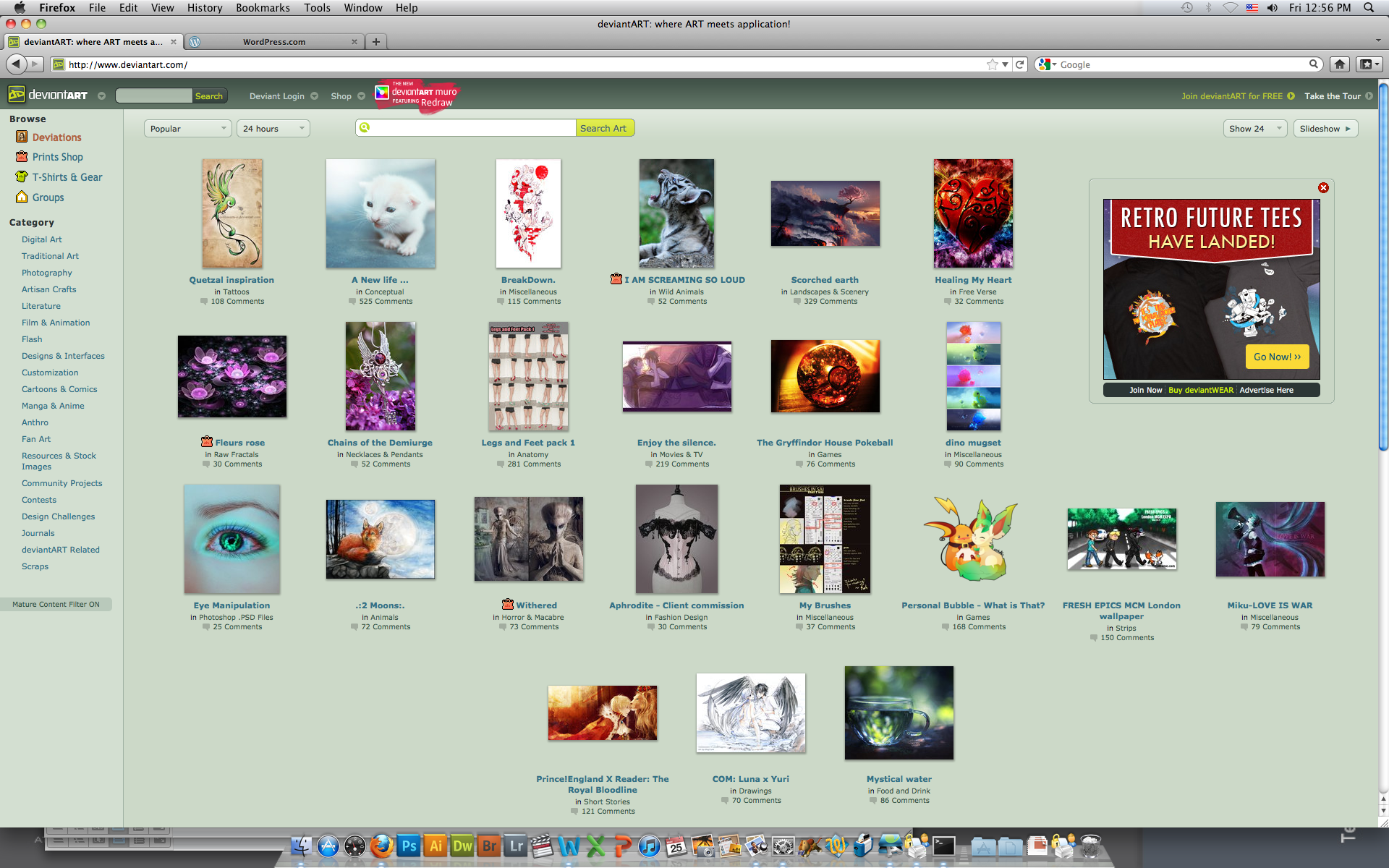
Devianart.com is an interactively growing art community website, Users can set up profile accounts on the site and post their artworks onto the account gallery for viewers; also they can communicate with one another via posting comments. Deviantart users together can set up group accounts to post a collection of artworks relating to their group theme.
There are two navigation options in Deviantart.com. On the left end of the page there is a column of arts directory. Artworks are organized by a comprehensive category structure, with different category and sub-category theme of arts, which browses through a list of related artworks. Artworks are presented between options of the most viewed and popular artworks and the new recent artworks. Artworks are also placed according to date its posted or number of viewers.
For example.
1) Category: Anime and Manga.

2) Sub category: Digital Media

3) Sub category: Manga (comics)

Deviantart has a wide variety of art media such as traditional or digital graphics artworks, photo, drawing, literature, even animation. They can be posted onto the web page. Users can find category on the directory panel. The direct search is generally to help find artworks by name instead of category, narrowing down the topic and title of artworks or to find a specific artwork.
Digital page and web graphics. GRDS-243-H01
David Sun
Images: screen shots from deviantart.com
Filed under Uncategorized
We7 Your personal DJ

Today I would like to critique the We7 website (www.we7.com). According to the official description of the website, this website is for audience to listen to free streaming music online. Choose from radio stations, artists and songs to create personalised radio stations. I was introduced to this website by my friend a few years ago and have been loving it since then. The website is placed flush left, which i personally will find it more attractive if the website is placed in the center. Because if we placed the website in flush left, it might look good in smaller resolution screen. However, if the user uses a bigger or highly resolution screen, there will be a lot of negative space left. (just like the print screen above) The website has made great use of the grid and that allows the viewers a easy eye flow.

The website has a very interesting background. The background of the website actually changes it’s color every time it loads a new page. In the above screen shot, I combined three different color backgrounds. As you can see even though the background changes a lot, there is still a high consistence, that unifies the website. The color is remain sharp, similar value and smiliar graphic style.

One of the reason why I love this website so much is because of the high interactivity between the user and the web. When you first log into the website, there will be a text box asking what kind of music you would like to listen. You can type in keywords and it will show you the music you want.

Sometimes when you have no idea what music you want to listen or you are tired of the old music you have. You can also click on different radio stations. There you can select the type of music you like. Every music station is very organize and they always surprise you with new and old music.

I believe one of the reason why they always come up with such awesome selection of music is because of the rating function. As you can see here, we can rate, no matter you like it or not, each single piece of music. There they can evaluate their selection. Also they are tones of ways to share music you like like facebook yahoo google..
The website has a very nice use of typography. Great use of san-serif font to give that modern look and suitable font size for reading. I found the graphics and buttons very user friendly. There is a great interactive flow and consistence of the webpage. Very effective use of technology since I never have any problems in loading/ opening the website. The one and only suggestion that I have for this website will be the positioning.
Lucia Ho| Assignment 3: Research & Presentation| Professor Winnie SOON| GDS 243| 24 May 2012
Filed under Uncategorized
Kraft food company’s website
http://www.kraftfoodscompany.com/home/index.aspx

The website that I want to introduce and discuss is Kraft food company. First of all, the logo of Kraft foods is at the top left corner with a small slogan “make today delicious”. The placement of the logo is clear and the audience will know that is the logo for sure.
The New York Stock Exchange commonly referred to as NYSE besides the logo. It is the current data and other information from official website of NYSE. The social media icons are on the top of the right hand corner. It provides Facebook, Public recommend on Google, Twitter, Bookmark and share. There have much more choice when you press “more” and I think it is so convenient to share because it provides enough social media ways for the viewer.Down below the social media icons, there is the search bar. It is over lapping with the social media icons, which I think will confuse the audience. There is a “Search” instruction so the viewers will know that they can search their needs in a faster way.
On the first web page, there is an advertisement about the latest news. Now is showing the Oreo turns 100 years. If you want to know more details, you can click the button down below. Here is the information about Oreo. It also mentions about the history of Oreo. I think the audiences can easily get the information about Oreo if you are obsessed with Oreo.

The navigation bars are “about us” “our brands” “delicious world” “investor center” “news center” and “join us”. They are all designed with different colors. I think it is good to attack the viewers to click on those. At first I have think about what is the reason that the designer of this site chose these colors for the navigation bar. And I found the answer that these colors are all the same with the logo’s color so it can corporate with the brand.
You can hold the button and it will shows different kinds of contents. All of the topics are flush left and have the space between each other. It is clear and comfortable to read. It will also change to blue color and the audience will know where is he/she clicking.
Down below of the site is the footer. There have the copy right and also some social media icons. On the right hand side, there is a follow us icon of the Facebook button. I have click on it and try. Finally the page that it pops out is the same with the footer icon. So, I think it is not necessary to put the follow us icon there again because it provides on the top of the right hand corner and the footer.
“About us”

The first content is “Who we are”. The information inside is really organized. The topic is bolded and only shows the main sentences so I can read easily. For example I really hate to read some long paragraphs but I can read easily and get the main idea or answer really quick. Also, some of them are point form, which I love it because I can remember what I have read instead of long information.
“Our brands”

It used the brand-font stylizations shown are protected and owned trademarks of Kraft Foods. I think it is fun and you can remember the brand-font design. For example- Oreo. You can find out the web site and other brands stand for O.
Other buttons are corporate with each page. All of the font size is comfortable for me to read and all the pages are clean and tidy. For me, I think it is a good website.
Filed under Uncategorized
Hair products

This is the website for a hair product brand called ” got 2b” I think is a very bad website with very less content.Basically, there are only 4 pages. First of all, the home page is very divided into 2 parts( left and right) On the top left, there are two logos, this is confusing, cause audiences may get confused about which is the right logo for the brand. Also, since the main image keeps repeating, it’s very annoying .On the right side, texts are kinda small, same to the images, a bite too small.The navigation bar is located in the centre. the top part of the right side is funny. A big bank area but with only one sentence, every itpropus is to link to another pages, I think it can be changed to the bottom right where the slogan is, and enlarge the slogan to fill up that part of space.

Second, when it comes to the performance page, the navigation bar changes position, from the centre to the left. In the centre part, texts are relatively small, this make it not easy to read.

On the History page, I think the image on the right is not related to the text. I think it’s off topic on this page. Also, the top part on the right where is appear on the homepage is missing on this page.

On the products page. there is only a very small paragraph to introduce the product, unlike, other website, the products are organized base on a grid system. Here there no images of the products, instead, there is a short video showing the products. This is very bad, that it gives no idea for the audiences about the products. This will not make the audience to remember and understand the products. eventually, the sales will be decreased.
Finally, I think the design of this website is wired, it doesn’t use up the whole page, all the informations are squeeze into a small retangle in the centre. This limited the amount of information the audiences can get. and it’s also confusing, cause there is hierarchy problem. Audiences don’t know where to start.
Overall, I think there are many problems in this website, the images and the text don’t really integrate together. And text is kinda small to read. There are many things to be improved.In order to increase the audiences interest.
Aidan Chan
GDS243_Digital Page and Web Graphics
Filed under Uncategorized
Online shopping – American Eagle Outfitter

This is the first page of the official website of the American Eagle Outfitter: http://www.ae.com/web/international/index.jsp
All the text and photos are placed at the centre of the page. It has buttons connecting to other different sites. It has searching function. And below is the footer. At the bottom, there is MY BAG.
Obviously the photos in the middle are the key visual of this page. The three different photos placed so closely together that we will view them as a group. At first i click think that the photo of the girl is linked to the women page. But when i click into it, a new box pop out:

Inside the box, it shows the info of the clothes that shown in the photos. Information includes different colors and sizes.
I believe this page will show the clothes that are on sales or new arrival to show viewers what is hot in this season.
Click into the women category:

It places the category bar on the left.When you randomly click into a sub-category, you will see there is a very clear grid system for the display of the clothes.
What I think is good is it allows viewers to customized this grid. It also allows to sort the clothing in different ways: top rated or price: low to high/ high to low. This kind of customization can help viewer to look for what they want in a quicker way, which is necessary especially when there are so many different products.
Besides these customization, the searching function help help viewer to search by feature or sizes. This can help viewer to narrow down the searching area. Thus reducing the searching time.
The most successful feature of the site I think is that it shows the instant change in color of the clothes. This not only increase the interactivity for viewers. It also help to save the spaces. Instead of placing the same T shirt with different colors one by one next to each other to display, it placed different square of the color choice below the T shirt. This really help save a lot of spaces.
Online buying is very different from real shopping in the way as you may not closely see the product clearly. Online buyers always have some concern about the quality of the products. But for this site, when you click into a particular product, it allows you to see clearly how the clothes look at the front as well as the back. This shows to viewers a more guaranteed quality.
The negative comments about this website is that the logo is a bit too small. And for the category part, i think the subcategory is not obvious as they only indent a bit. maybe they can use a smaller font size or use lowercase for that.
Another problem is the footer. It is too crowded. Although the information of footer is not that concerned but readability should still be maintained. It should avoid placing those small texts too close to each other.
What bother me the most is the top column. Aerie and 77 kids are the sister brand of American Eagle Outfitter. I think it is strange to put them at the top next to my account and facebook. It would be better to put them at the bottom.
I also found another fashion website which I find it better in these points: Abercrombie & Fitch http://www.abercrombie.com/webapp/wcs/stores/servlet/StoreView?catalogId=10901&langId=-1&storeId=15108

It also places the category bar on the left. The sub-category is much more obvious than that in American Eagle.
It does not only indent the text but also uses a lower value of gray.
Also, A&F also has sister brand company linked in the website. They are placed at the bottom next to the footer.
The placement of the link button here is much more consistent with the design.

Gogo Chan Hiu Ying
Digital Page and Web Design
Filed under Uncategorized
Etude House
http://www.etudehouse.com/gate.html

This is the website of a Korean cosmetic product (Etude House). The above image is the welcome page of Etude House. Although we may not stay at this page for so long, but the designer do cares about the graphic here such as, the buttons were well designed while the illustration of the shop was included. You can choose one of the languages among Korean, Japanese, English and Chinese to enter the pages. Unfortunately, the pages for English and Chinese are still under construction. So what we can choose at this moment is either Japanese or Korean.

This is the homepage of Etude House. The menu bar is placed on the top in a horzontial column with pink background. When mouse hover on a specific category in this column, a big rectangular box will pop out with different items that are related to that specific category and the style of the button will change to another style as well. The most updated issues will be the largest and was placed on the toppest area and it will change to another new issue after few seconds automatically. Followed by, the issues that are least important will be placed below them. Five columns are used for the most update issues and two columns are for the least important issues and one column is also used for some specific products.

Here is the page after I clicked on the first category. Different categories were placed on the left hand side with light pink background. When mouse hover it, the color of the words will change from black to white and with pink border. Also, a small box will pop out with specific items. The best items will be placed on the toppest area. Items for you to purchase will be placed below the “best items”. Although you may not understand Korean, but with the help of the photos, it makes the whole process more easy and relax. Prices were placed under every items, it kinds of help you to measure the amount of money you needed and the amount of money that you may spend on these products. One interesting thing for this website is, you can search the products by colors. After the decision that you made, items with specific colors will show up. As a result, shorter period of time can be spent on finding a product.
Becky Wu
Digital Page and Web Graphics
Filed under Uncategorized
